Style Logos for Online Catalogue Listing
Business logos need some preparation before being submitted to online catalogues:
- pictures must be of particular dimensions and ratio
- colors should be adjusted to match the catalogue’s color palette and background
- the listing should look superior to other businesses when viewed in a grid or side by side
- as the background picture is resized depending on the screen size,
the logo should always look good on top of it
Let’s go through two examples.
Insight Optometrists and Vedelago Optometrists asked to prepare their logos for placement in AfterPay.com. Here is how the grid looks like when searched for optometrists:

Or, when viewed on a smaller screen:

From learning the catalogue website HTML structure, and from the two examples above come the requirements:
- deliverables are two separate files: 1) a white logo with a transparent background, and 2) a background image
- the logo must look good when sized down 60% to its original size (it is resized and centered on top of its background automatically by the catalogue style rules)
- not all competitors look clear in the grid, so there is an opportunity to make my client logos look exceptionally good compared to others when viewed side by side
The next step was to draw the client logos in Adobe Illustrator with using vector graphics, so that the quality of images do not deteriorate when resized. The original logos were PNG/JPG files in medium quality, so it was part of the job to draw the logos from scratch.
Optometrist source logos:


Logos reconstructed in vector:


One thing to note here is how the Vedelago logo in white needed some adjustments in order to visually separate the three circles. In the original colored logo they were distinguishable because of the colors. In white, however, a simple trick allowed to keep the circles separate:

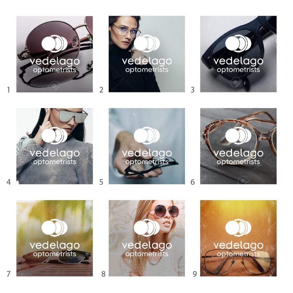
Once done, it is time to compose mock ups of multiple variants with different backgrounds for the client to choose from. Here is an example for Vedelago Optometrists:

Another useful mockup is of the business logo placed right in the catalogue search results along others:

Now it is time to put everything in a PDF file demonstrating all variants and catalogue mockups in a single document. For demonstration purposes, I made both presentations available for you to download. These files are what I sent to the clients:
To sum it up: don’t just upload your media files to catalogues as is. A little extra effort can make you stand out among the rest.
Get your catalogue listing planned and completed quickly: